Challenge: Create a Typeface purely out of the manipulation of paper
Experimental Driver: Depth, Light & Shade
[ Typography_2017 ]
Goal: How does one go about manipulating paper in such a way that it does not feel like 'origami'? The aim here is to find an interesting way to create a typeface without a difficult folding technique. I will share with you, the challenges I had through my process as well as the outcome. This is all about experimentation and controlling several elements, heading in an undefined direction.
Process_Conception
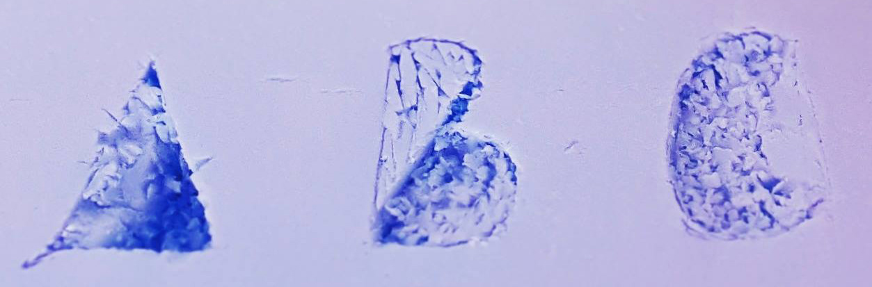
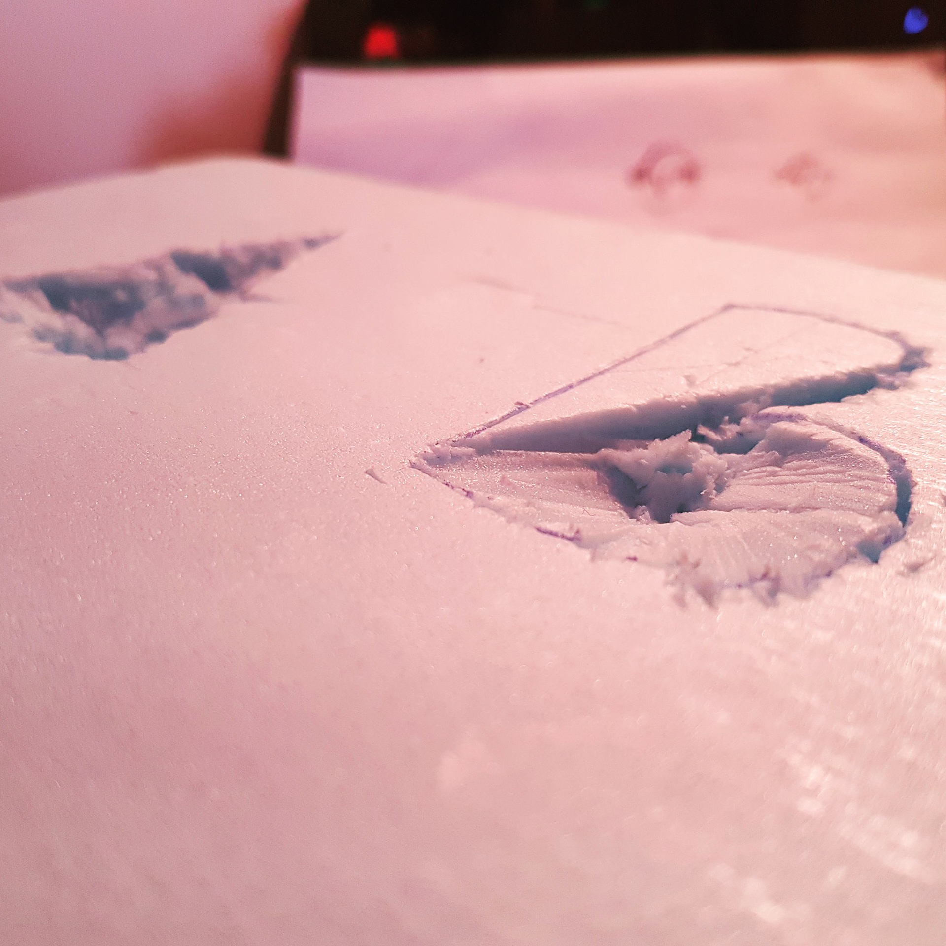
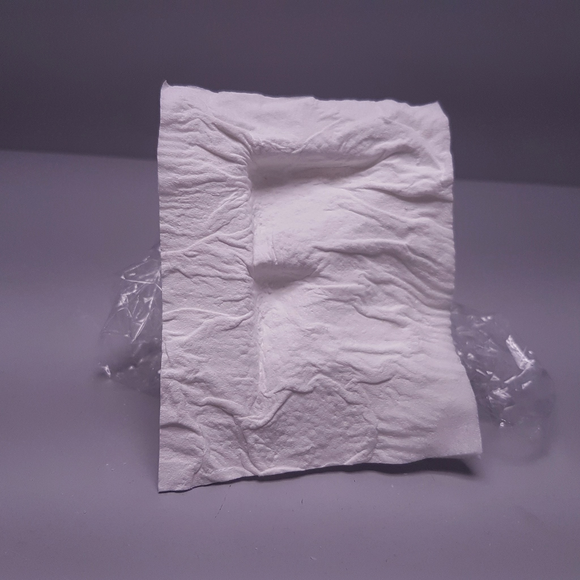
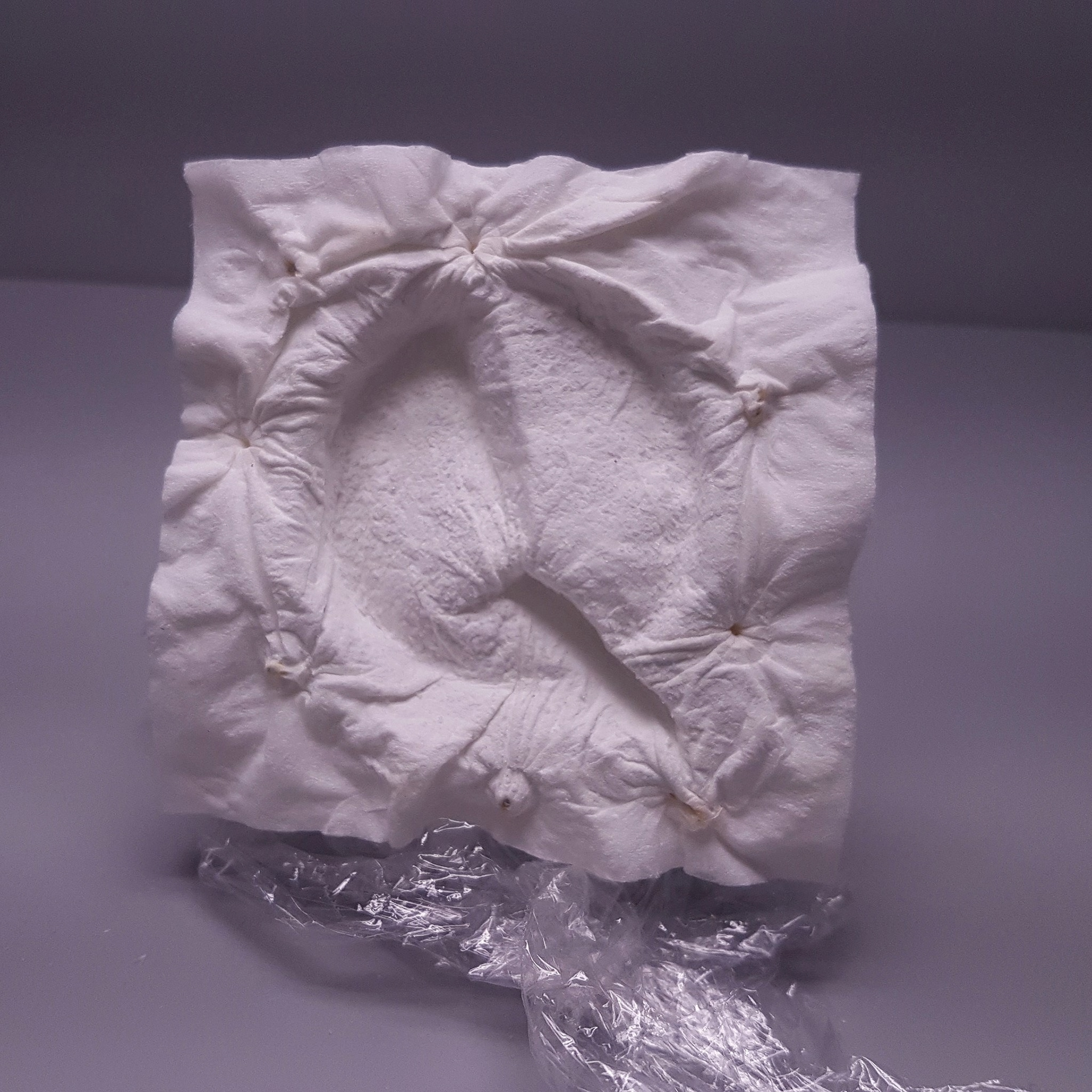
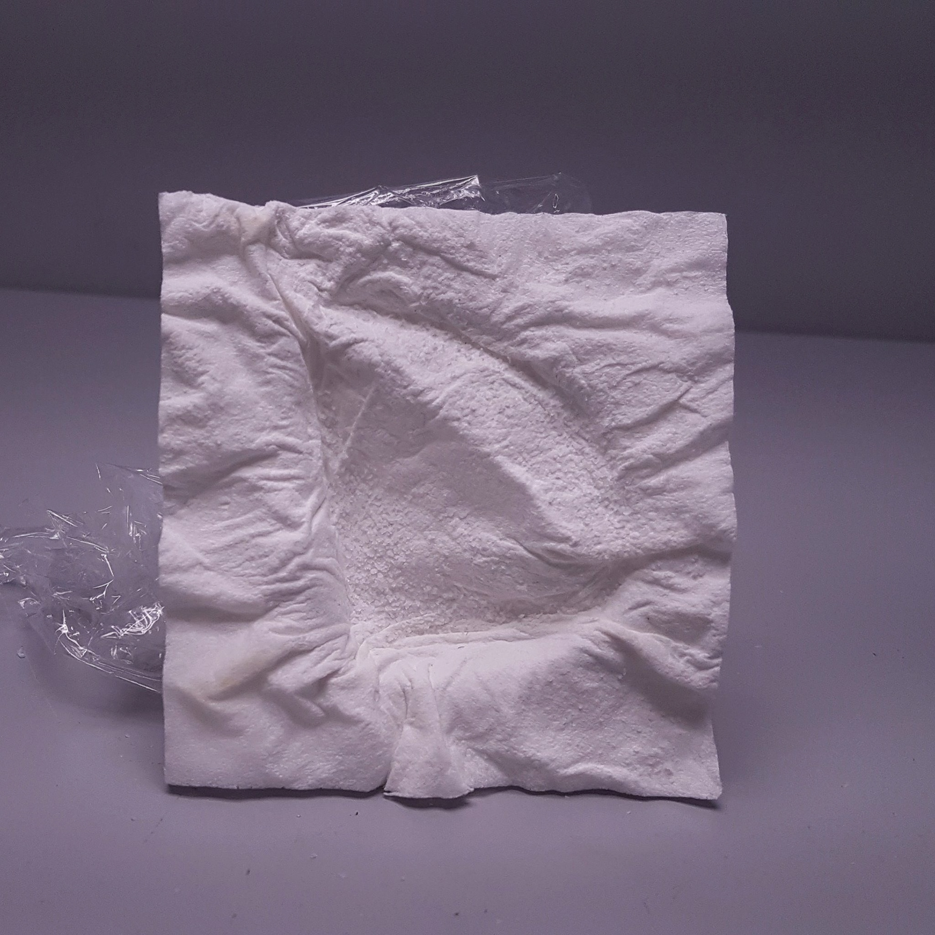
"Where to begin?" < This has to be the hardest question in the experimental process. After surveying all the supplies I have, bluefoam looked most attractive. But there has to be a control: "Bluefoam is not paper"...crap. I worked with it anyway. Never know where it could lead. Main thing to watch out for is potential. So many possibilities!
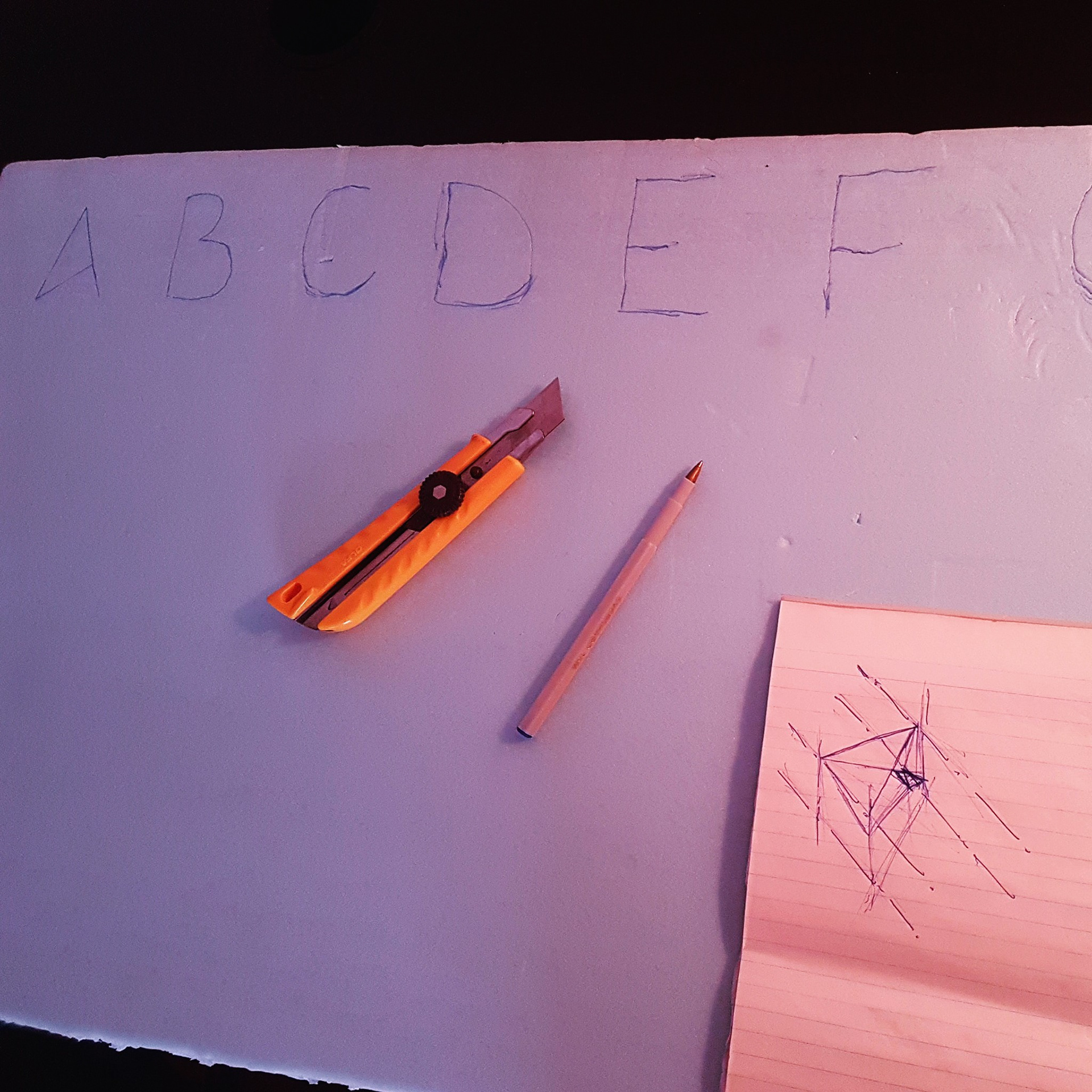
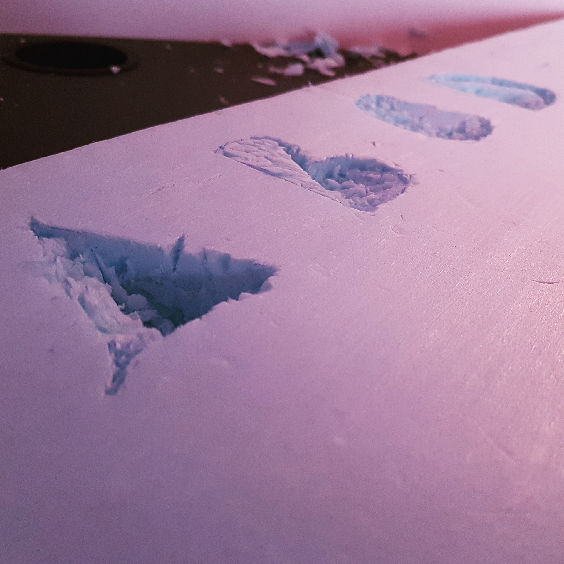
I tried different things too >>
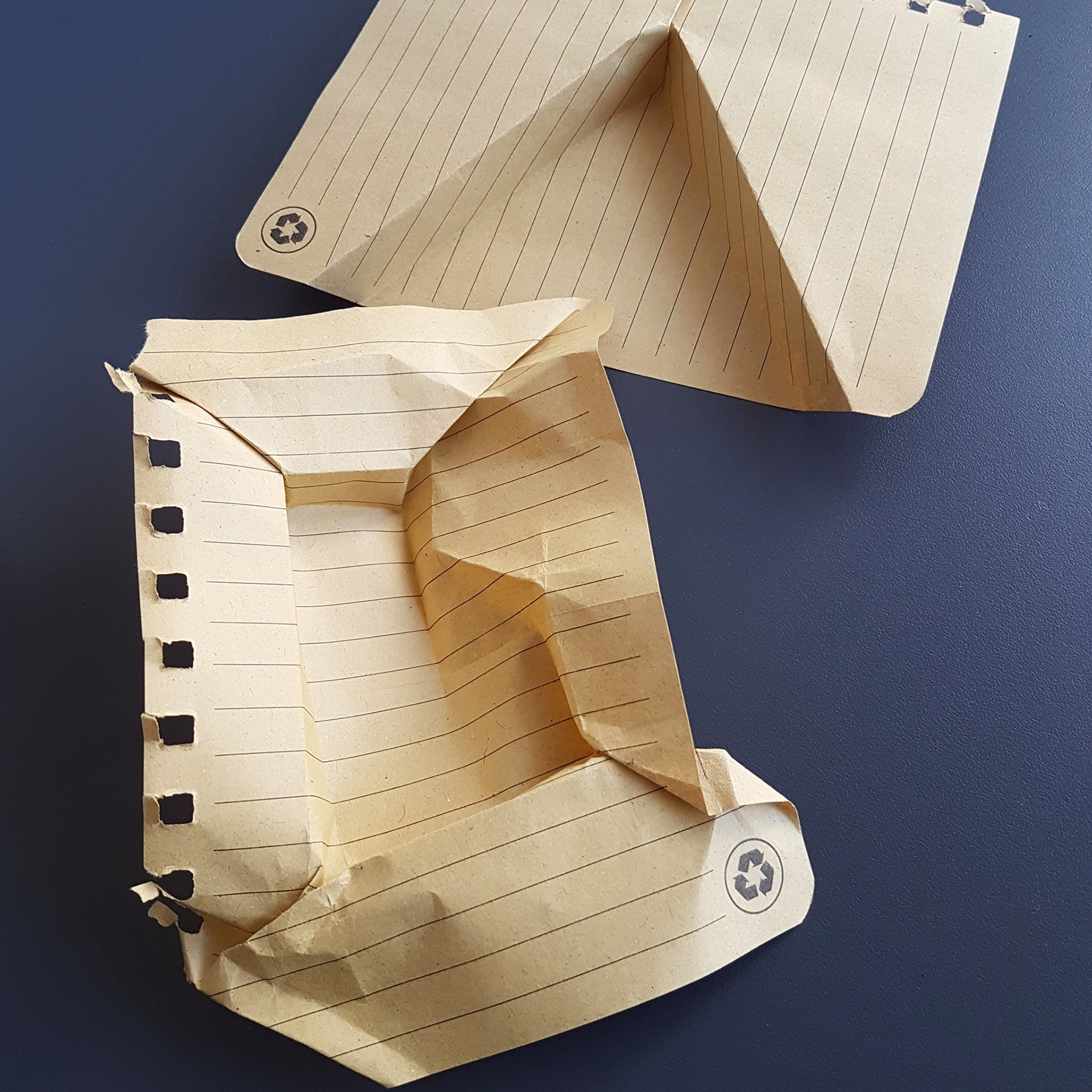
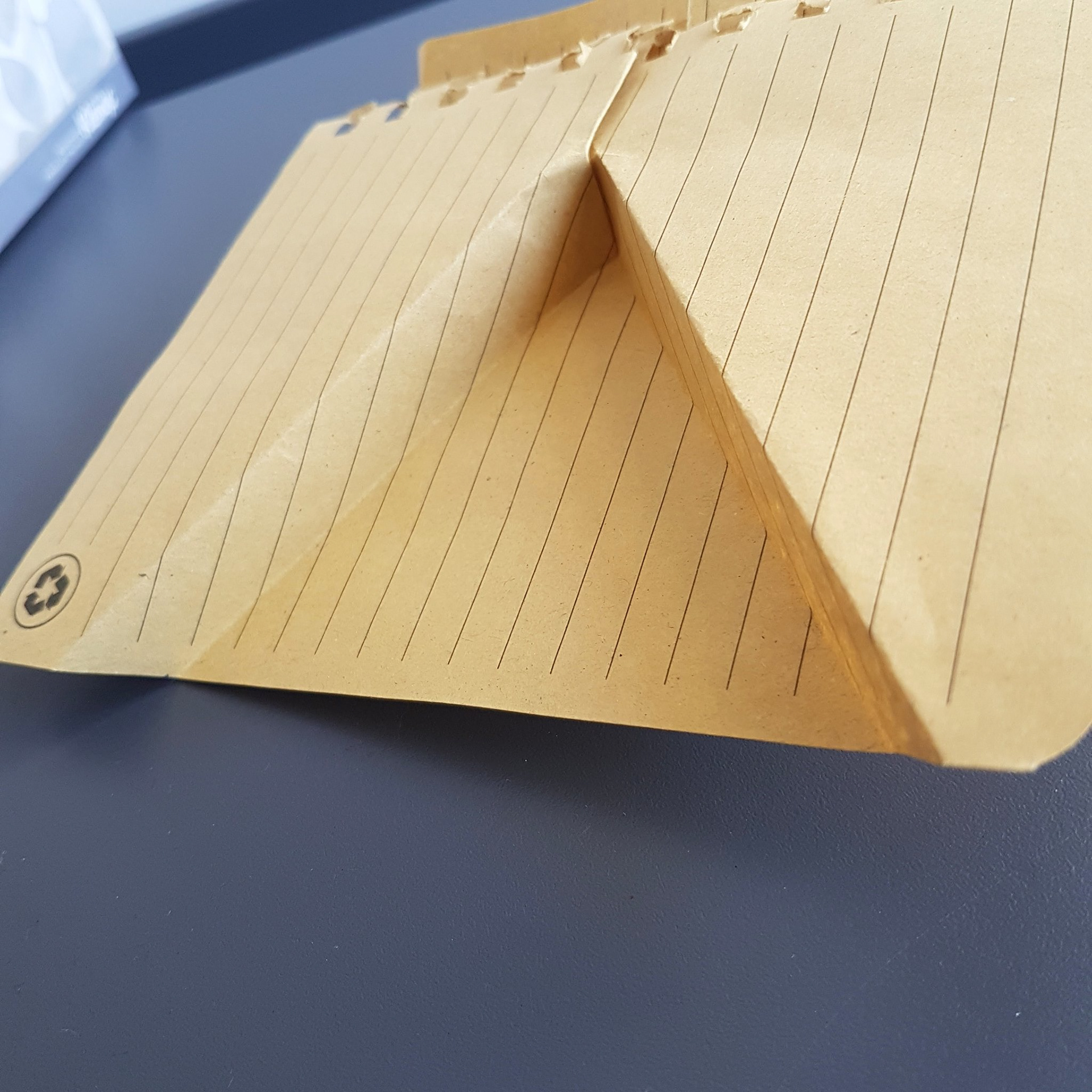
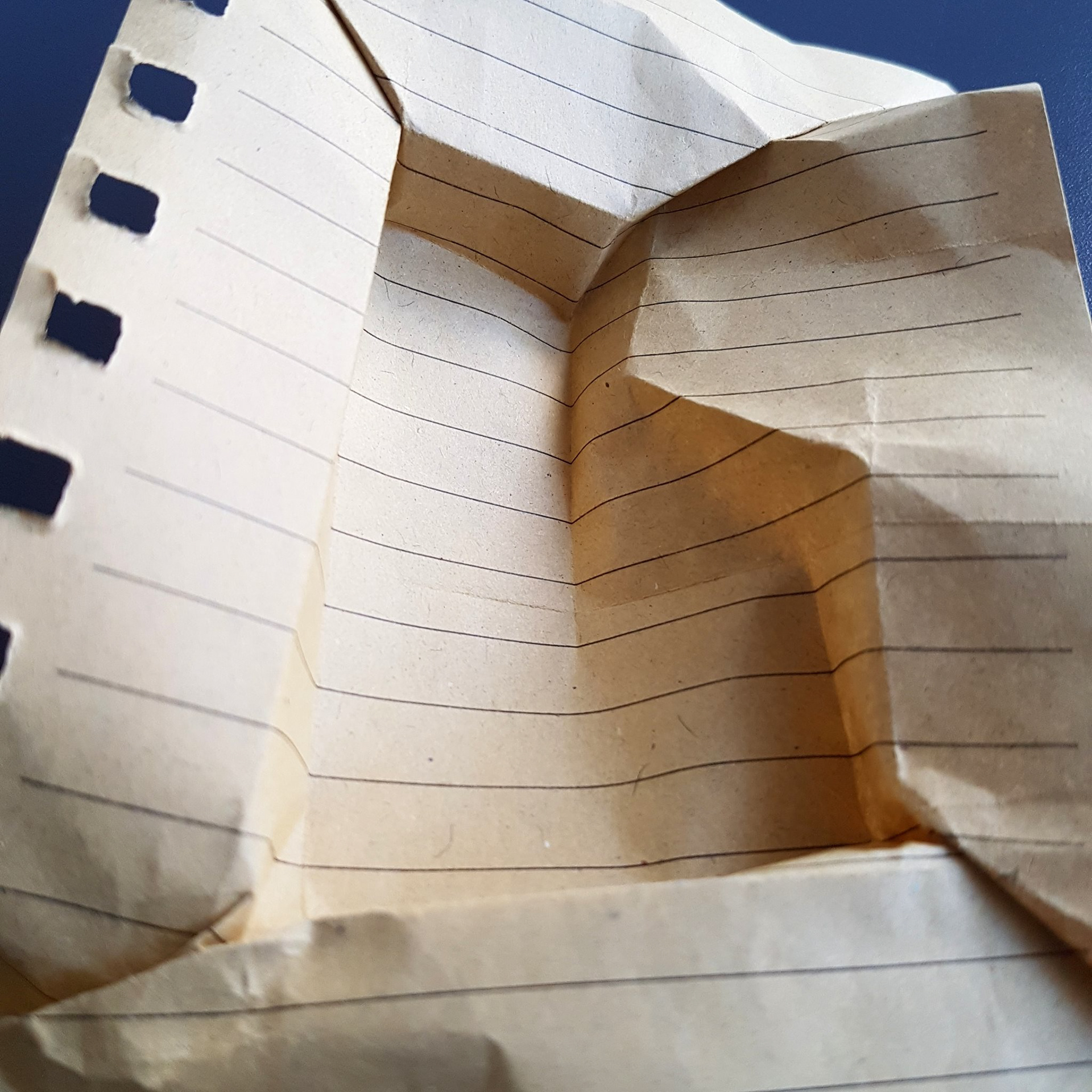
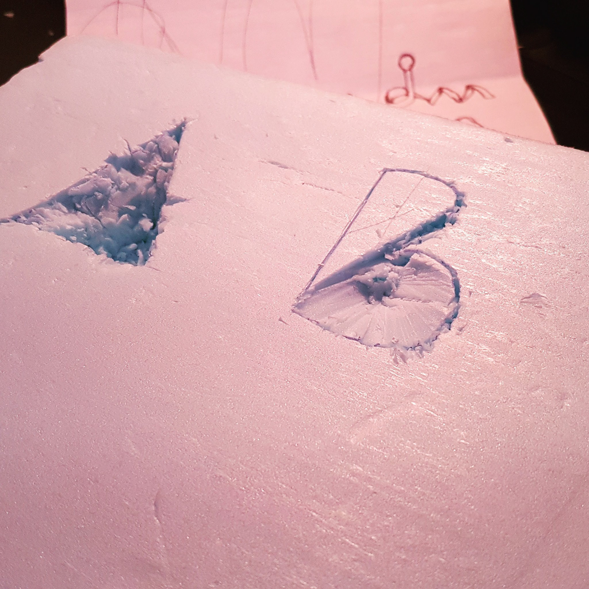
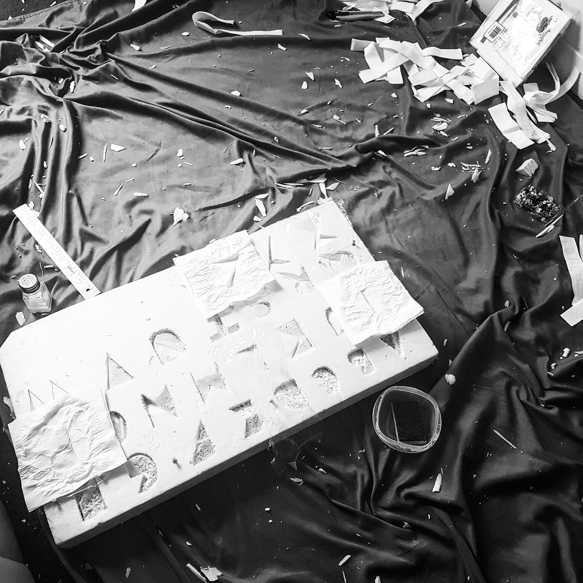
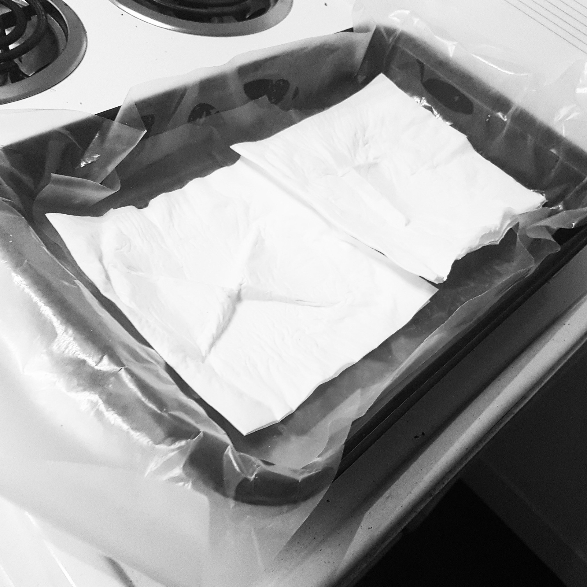
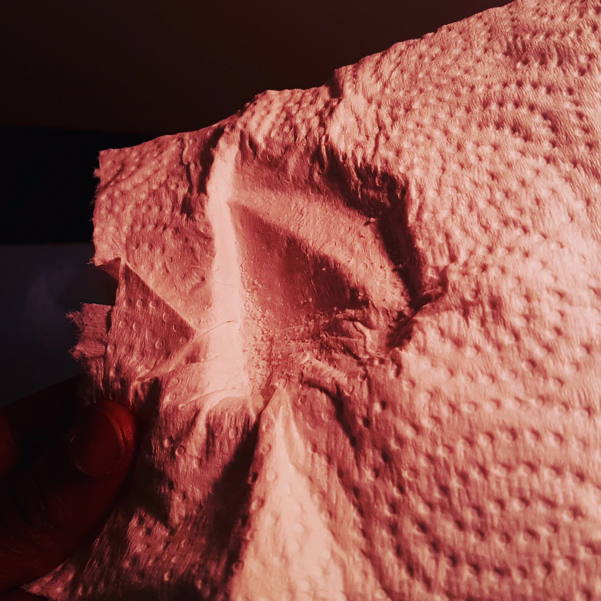
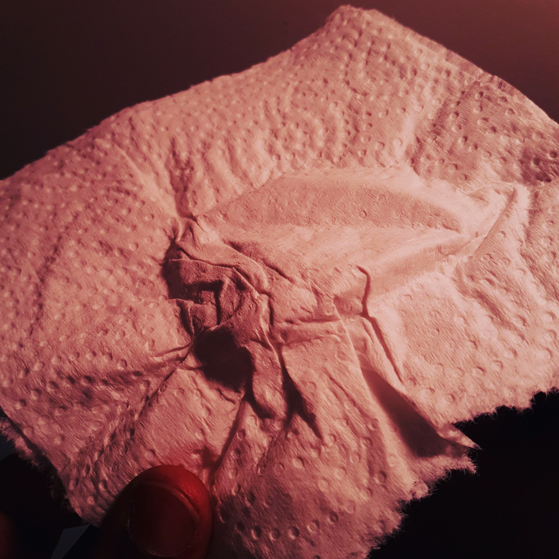
What started off with bluefoam, evolved to an exploration with tissue, paper towels and other interesting things. The foam became the mold that helped create the forms.
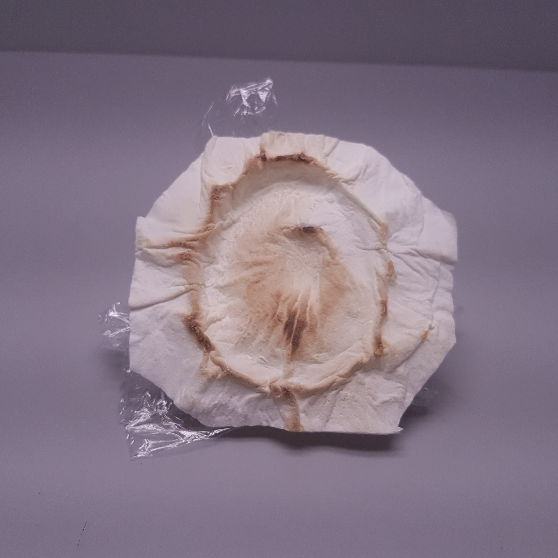
Ingredients: Paper, Water, Salt
Tools: Craft Knife, Pen, Ruler and a "Stove" (The stove was a bad idea. I burnt the "O")
Building Cohesion
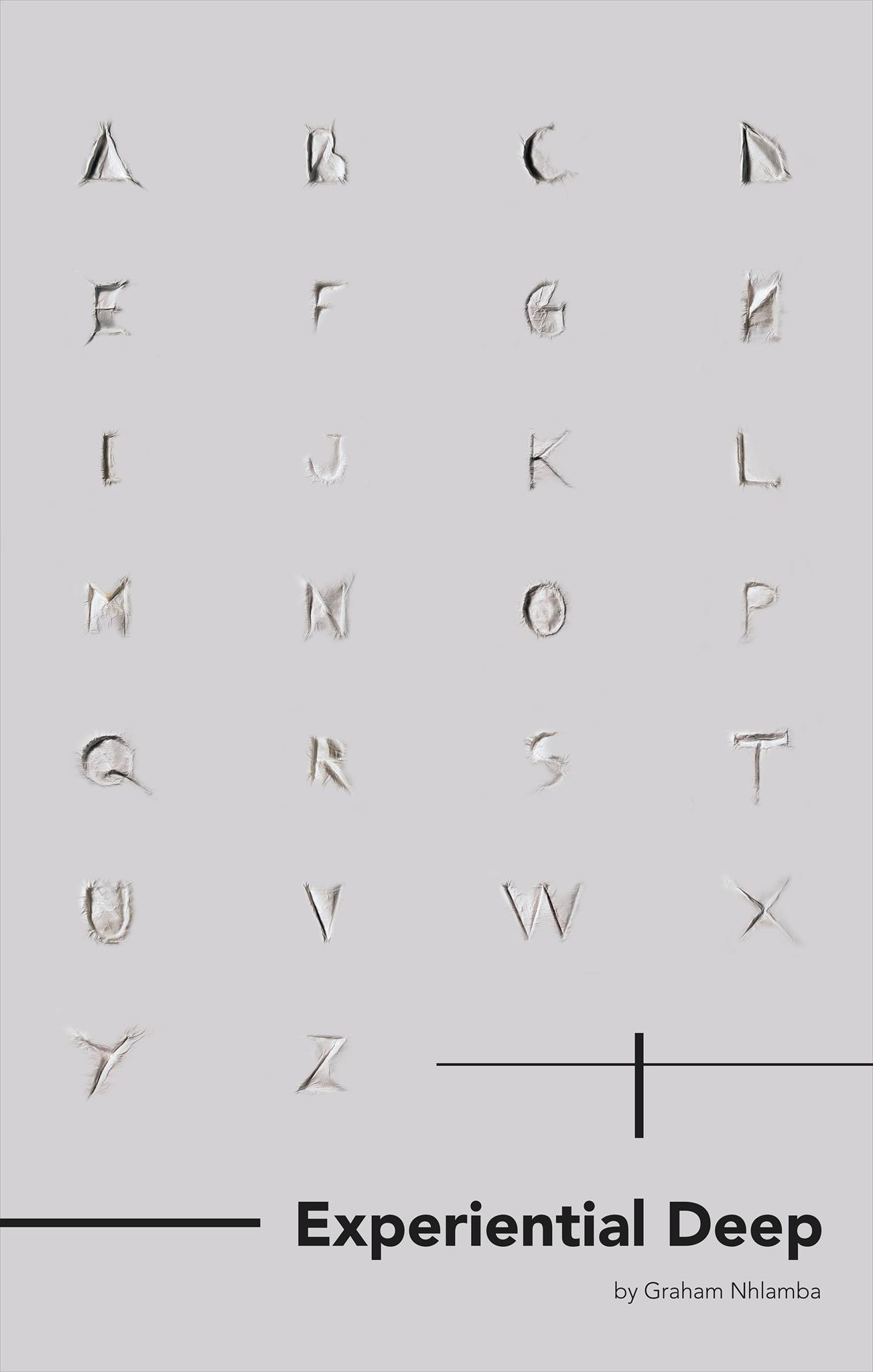
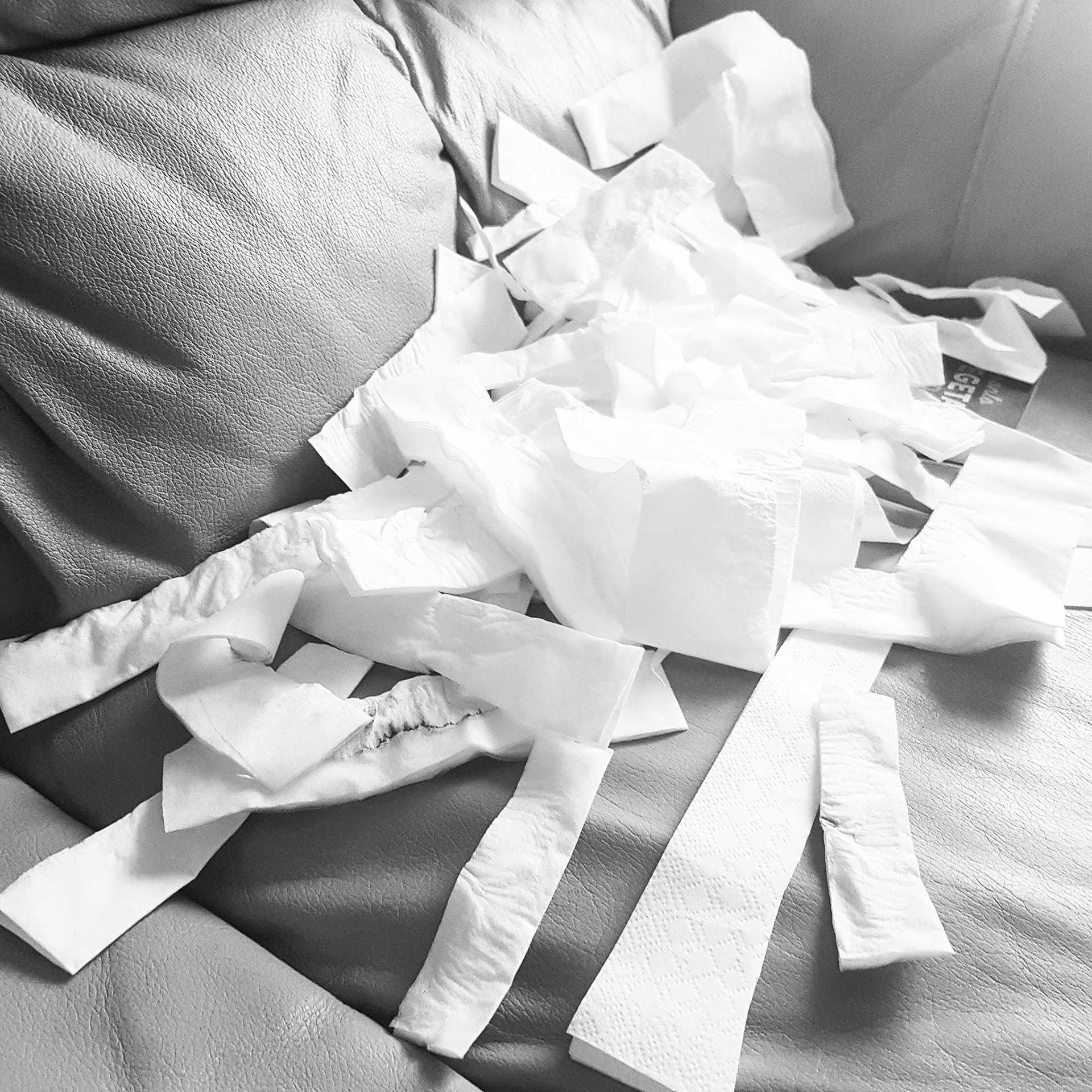
I ended up with this. 26 Uppercase Letters of the alphabet. Now to make it all work together >>> Photoshop became my best friend.
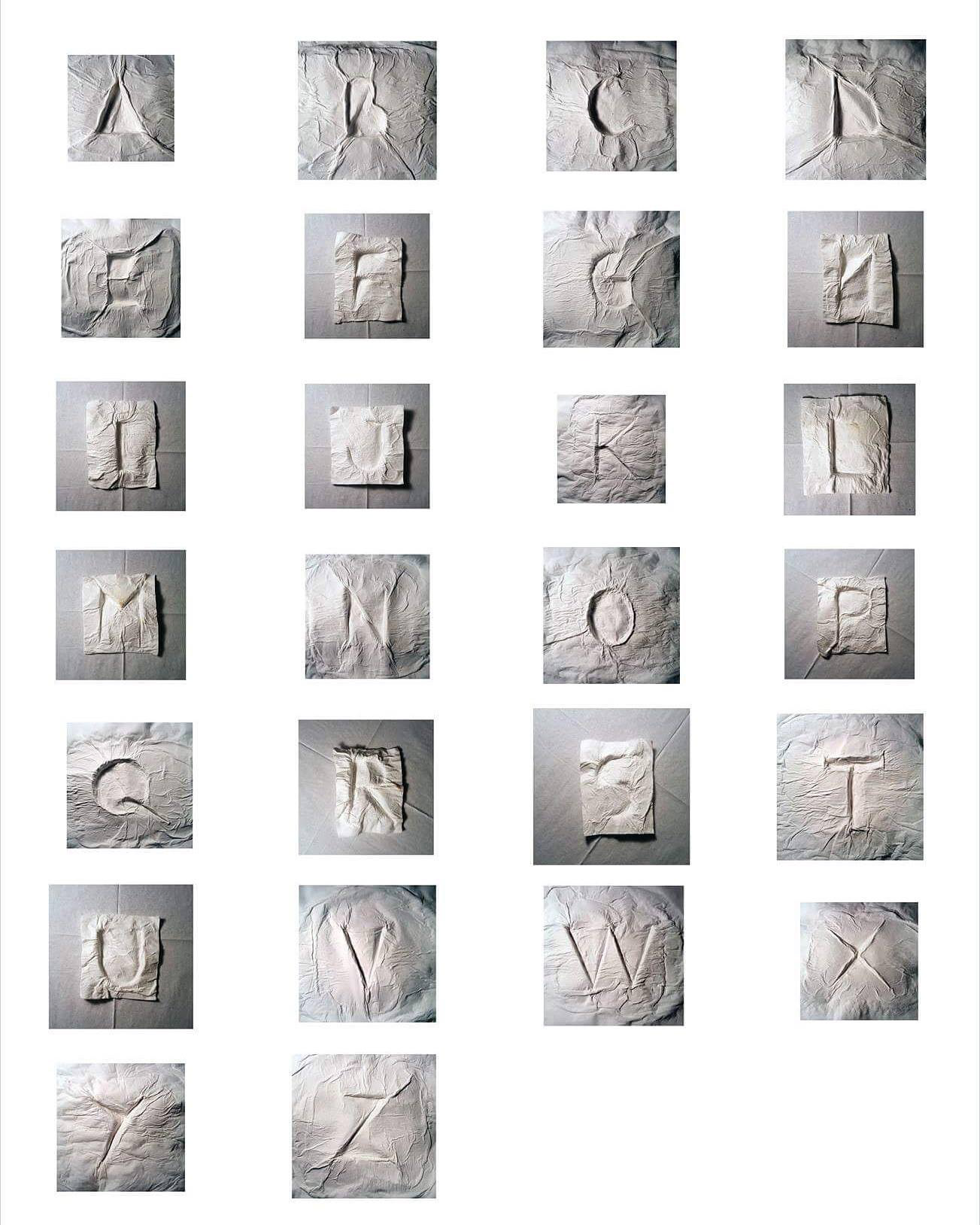
The Outcome